Category: Case Study

  • Navigating Uncharted Waters: Mitzi’s Quest for a Unified Digital Presence

    Navigating Uncharted Waters: Mitzi’s Quest for a Unified Digital Presence

    Navigating Uncharted Waters: Mitzi’s Quest for a Unified Digital Presence

    Mitzi Alexander, an accomplished travel advisor operating in Bloomington, Indiana, found not having a website hindered her ability to effectively reach and engage her target audience.

    Despite her extensive industry expertise and commitment to delivering exceptional service, Mitzi lacked a cohesive online presence. The absence of a dedicated professional website posed a critical challenge, as she had no centralized platform to showcase her offerings comprehensively, share valuable insights through a blog, and cultivate direct connections with potential and existing clients.

    Blogging, in particular, represented a missed opportunity for Mitzi. As a powerful content marketing tool, a well-executed blog could have allowed her to establish thought leadership in the travel advisory space, improve search engine visibility through SEO-optimized content, and foster engagement by providing travellers with informative tips, destination guides, and firsthand accounts of her experiences.

    Without this essential digital asset, Mitzi’s marketing efforts were fragmented across various social media channels and disjointed web properties, resulting in a disorganized and inefficient approach to client acquisition and retention. This lack of a unified digital hub not only hindered her ability to reach a broader audience but also compromised the professional image and credibility she aimed to project.

    Recognizing the escalating importance of a robust online presence in the travel industry, Mitzi understood the urgent need to implement a comprehensive digital strategy. Establishing a well-designed, user-friendly website with a strong content marketing focus would be crucial to elevating her brand, amplifying her expertise, and ultimately driving sustainable business growth in an increasingly competitive landscape.
    Custom CSS for Unique Branding

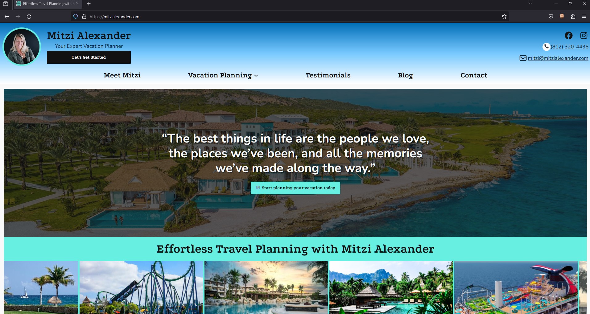
    We delved deep into the customization of the WordPress 2024 theme, employing custom CSS and useful plugins to tailor the site’s aesthetics to Mitzi’s brand identity. This involved tweaking the color schemes, font styles, and layout structures to create a cohesive look that resonated with the essence of travel and adventure, essential to Mitzi’s business.

    Interactive Features for Enhanced Engagement

    To improve the site’s user engagement, we integrated a variety of interactive features. These included hover effects that reveal more information, smooth transition animations that guide the user through the site, and clickable elements that invite exploration and discovery. Each interactive feature was designed to enhance the user journey and encourage deeper engagement with the content.

    Drop Shadows for Depth and Dimension

    We employed subtle drop shadows in strategic areas of the website to add depth and dimension to the design. These carefully crafted shadows provided a soft lift to images and content blocks, creating a layered effect that drew users’ attention to key elements of the site. This technique not only added visual interest but also helped in organizing content in a more digestible and appealing manner.

    Emojis for Relatability and Fun

    Understanding the importance of relatability and personality in digital communication, we incorporated emojis throughout the website. These emojis were selected to complement the textual content, adding a touch of fun and approachability to the site. Whether used in headings, bullet points, or within blog posts, emojis helped to break down barriers and connect with users on a more personal level.

    ❤️ 🛳️ 🎢 🍹📞✉️📓💬 ❤️ 😃🔍 📝 🗒️🏝️ ⛰️ 🌍☕️🍦👨‍👩‍👦‍👦🩴❤️‍🩹🗼 🌆 🏛️⛰️ 🌌 🔥🌴 🌊 🦜🧭 🗺️🍽️ 🎉❄️ ☀️👨‍👩‍👧‍👦 👩‍❤️‍👨🎢🎡😆🪄📔🍹☀️🍽️ 🥂🧘 ⛷️ 🏄🏊 🧖👶 🧒 🧑 🧓😉

    Custom Features Tailored to Travel Planning

    To specifically cater to the needs of travel planning, we developed custom features that enhanced the functionality of the site. This included dedicated pages for specific customer types, a blog section with different travel categories, and testimonials with shared experiences from Mitzi’s satisfied clients.

    Keyword Research and Integration

    To bolster the website’s search engine visibility and attract Mitzi’s target audience, we employed a comprehensive SEO strategy using the Yoast SEO plugin, a powerful tool known for its effectiveness in optimizing WordPress sites for search engines.

    Our first step was conducting thorough keyword research to identify terms and phrases closely aligned with Mitzi’s services and the interests of her customer personas. This research included a deep dive into travel-related terms, with a focus on niches like honeymoons, cruises, theme parks, and all-inclusive resorts. We meticulously integrated these keywords into the website’s content, including headings, body text, and image alt tags, ensuring relevance and contextuality.

    Optimizing Metadata for Enhanced Discovery

    With the Yoast SEO plugin at our disposal, we optimized the website’s metadata with precision. Titles and meta descriptions for each page were crafted to include targeted keywords while remaining engaging and informative. This not only improved the site’s visibility in search engine results pages (SERPs) but also increased the click-through rate by compelling users with enticing summaries of what Mitzi’s site had to offer.

    Improving Site Structure for SEO

    Understanding the importance of a well-structured website for SEO, we used Yoast’s insights to organize Mitzi’s site content in a way that enhanced navigability and relevance. This included creating a logical hierarchy of headings (H1, H2, H3, etc.) and ensuring that internal linking was both user-friendly and beneficial for search engine crawlers, thereby enhancing the site’s overall SEO performance.

    Content Optimization for Engagement and Relevance

    Each piece of content, especially the blog articles, was carefully optimized to strike a balance between engaging Mitzi’s audience and meeting SEO best practices.

    Outcome

    In the journey of building and launching Mitzi’s website, our collaboration was not just a one-time project but the beginning of an ongoing partnership. We are committed to providing Mitzi with continuous support, ensuring her website remains up-to-date, secure, and aligned with the latest web standards and trends. Our team is here for regular maintenance, updates, and to answer any questions or address any challenges that may arise.

    Looking ahead, we see a wealth of opportunities for future projects with Mitzi. As her business evolves and her needs grow, we are excited to explore new avenues to enhance her digital presence further. Whether it’s expanding the website’s functionality, integrating new tools and features, or embarking on targeted digital marketing campaigns, we are eager to continue our collaboration.

    Our goal is to be more than just a service provider for Mitzi; we aim to be a trusted partner in her business’s growth. By staying engaged and proactive, we anticipate the needs of her travel advisory business and offer solutions that not only solve immediate challenges but also pave the way for new opportunities. This long-term partnership underscores our dedication to not just meeting but exceeding Mitzi’s expectations, driving her business forward in an ever-evolving digital landscape.

    David Martin shares his final thoughts on the project:

    Dave Martin: “Working with Mitzi on her website has been a uniquely rewarding experience. It’s always a pleasure to receive referrals from existing clients, and having the opportunity to work closely with both Mitzi and her husband has truly been a highlight. The collaborative spirit of this project allowed us to delve deep into Mitzi’s vision and bring it to life in a way that resonates with her passion for travel. It’s projects like these that remind me why I love what I do.”

    The project with Mitzi Alexander was more than just building a website; it was about capturing the essence of her passion for travel and creating a digital space that reflects that enthusiasm. The collaborative process, from conceptualization to launch, has been a testament to the power of partnership and shared vision. As a team, we look forward to supporting Mitzi in her ongoing digital journey and are excited about the potential for future collaborations that continue to push the boundaries of design and functionality.

  • Building 67 Storage: A Branding Case Study

    Building 67 Storage: A Branding Case Study

    Transforming Ideas into Virtual Reality: The Genesis of 67storage.com

    The creation of 67 Storage was a branding project that challenged our creativity and technical expertise but also strengthened our belief in the power of one-on-one collaboration.

    Our partnership with Roman, the business owner behind 67 Storage, started with a mission to craft a digital web presence and branding that mirrors the efficiency, security, and user-friendliness of their recently built storage units on Highway 67.

    Our branding project began with making a pivotal decision. Roman initially sought to name his venture after his last name, “Manley Enterprises”. However, after sitting down with Roman and getting a better understanding of his marketing goals, we found an opportunity for a more intuitive connection with potential clients.

    We brainstormed and design a brand that wasn’t only a name, but also a literal signpost. A logo that encapsulated the business’s essence and its geographical significance. Drawing from its strategic location off of Highway 67, “67 Storage” was born.

    This decision wasn’t just about picking a name—it was about crafting a scalable, recognizable, memorable, and easily searchable brand identity across both digital platforms and physical mediums for future customers. ’67 Storage’ was more than a choice; it was a strategic decision that streamlined the discovery process for potential clients.

    Brand Identity Creation – Forging the 67 Storage Identity Inspired by the Open Road

    With the name “67 Storage” setting the stage, the journey towards creating a cohesive brand identity began.

    Color Scheme

    A Palette Born from the Road

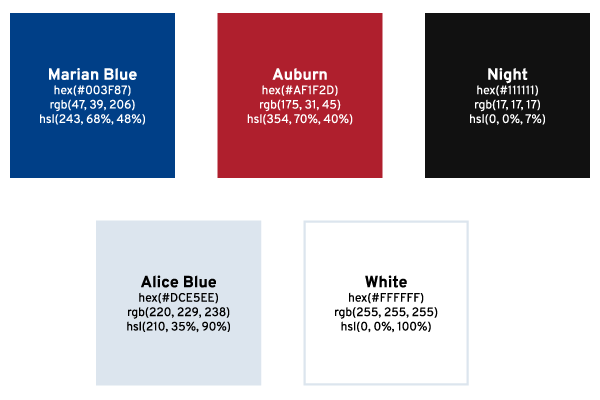
    The color scheme transitioned from concept to palette, drawing from the distinctive colors of highway road signs. This choice was intentional, aiming to evoke a sense of reliability and guidance, much like the road signs that navigate travelers to their destinations. The colors chosen were more than just visually appealing; they were a narrative in themselves, telling a story of trust, direction, and safety.

    Typography

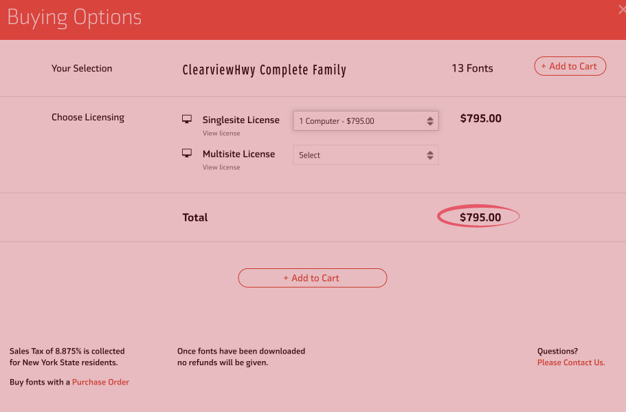
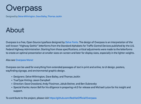
    Typography plays a pivotal role in bridging 67 Storage’s brand identity with its digital presence. Research into the typography of highway signs—specifically Highway Gothic and Clearview—revealed the practical challenges of licensing and digital optimization. Thus, for the logo, we chose Interstate, a font inspired by highway signage yet suitable for digital use, found on Adobe Fonts. For the website, Overpass from Google Fonts was selected for its web optimized design and open source license, ensuring a consistent, readable online experience. This thoughtful selection allowed us to maintain a connection to the brand’s roots while adapting to the digital landscape.

    Screenshot of the ClearviewHwy Complete Family font licensing options showing a price of $795 for a single computer license.
    ClearviewHwy font single computer license purchase page indicating the cost of $795, which informed the decision to select Overpass for the 67 Storage website.
    Informational screenshot detailing Overpass, a free, open-source typeface from Google Fonts, designed for web and environmental graphic design.
    Screenshot highlighting Overpass, a versatile typeface from Google Fonts, chosen for its compatibility with 67 Storage’s branding and logo.

    Logo Design

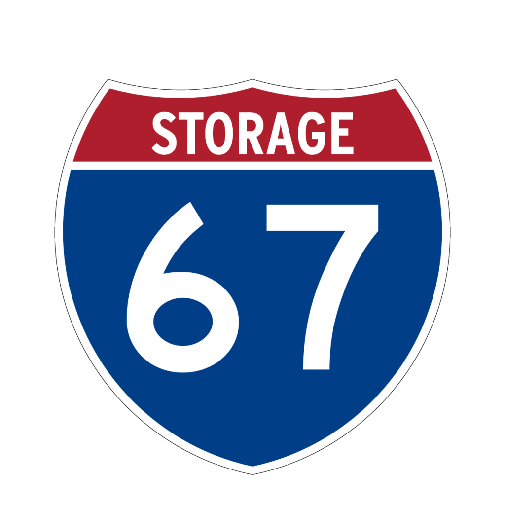
    Drawing inspiration from the very roots of the name, the brand’s visual identity took cues from highway signs—a nod to the name’s origin and a brilliant play on familiarity and visibility. The logo was fashioned to mirror the clarity and straightforwardness of highway signage, ensuring instant recognition and connection.

    Logo of "67 Storage" resembling a traditional American highway sign with a shield shape, red and blue color scheme, and large white "67" in the center.
    Logo of "67 Storage" resembling a traditional American highway sign with a shield shape, red and blue color scheme, and large white "67" in the center.
    Logo of "67 Storage" resembling a traditional American highway sign with a shield shape, red and blue color scheme, and large white "67" in the center.
    Logo of "67 Storage" resembling a traditional American highway sign with a shield shape, red and blue color scheme, and large white "67" in the center.
    Logo of "67 Storage" resembling a traditional American highway sign with a shield shape, red and blue color scheme, and large white "67" in the center.

    Business Card Design

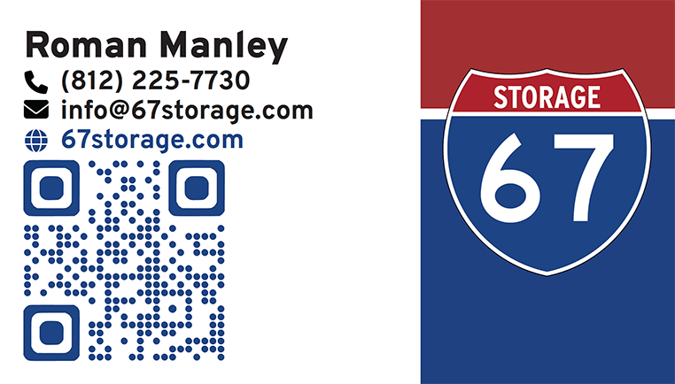
    Business card for 67 Storage featuring contact details, a QR code for the website, and the company's shield logo with the number 67.

    For the business card, we compressed 67 Storage’s brand identity into a readable, impactful design. The layout and iconography is intentionally minimalist to focus on clearly displaying key contact information. To balance the white space of the card, we crafted a background that aligns with the shield logo on the right. This enhances the card’s visual appeal and brand recognition. Moreover, a QR code links to the 67 Storage website for ease of customer access. Our design approach makes the business card an efficient networking tool and extension of the 67 Storage brand identity.

    Picking 67storage.com: Securing a Strong Online Presence

    Selecting the right domain name for 67 Storage was a crucial decision to make. Picking an overly complicated or hard to remember domain name could considerably impact it’s ability for customers to find and remember. To avoid this, we decided on 67storage.com, a short, straightforward domain name that both reinforces the brand identity and simplifies the customer’s journey to finding the business online online.

    WordPress Website & Design: Crafting a User-Centric Online Space

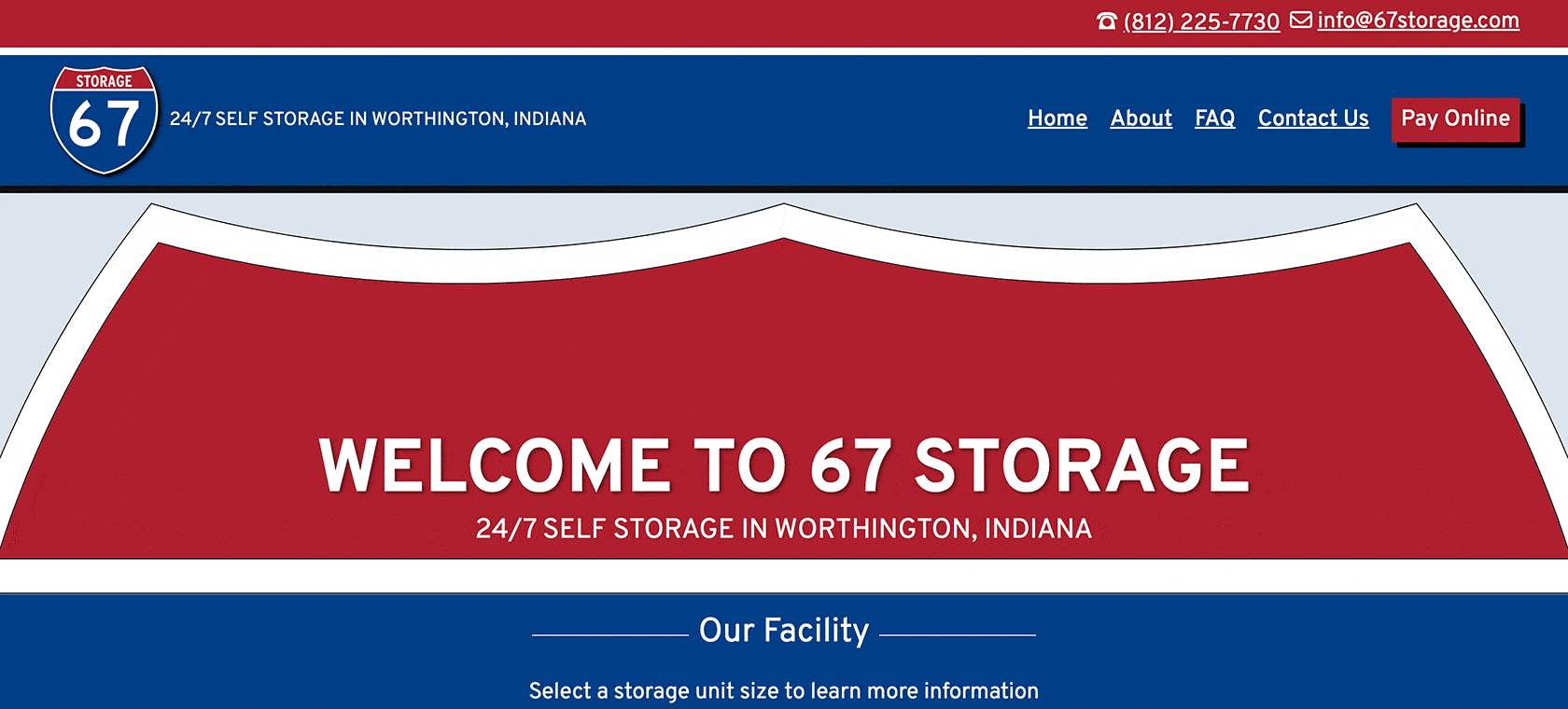
    The website for 67 Storage was intentionally designed to radiate its unique identity while focusing on two primary objectives: attracting new customers and enabling online payment for storage unit rentals. Using WordPress, we customized the latest 2024 Theme and enriched it with hand-coded Custom CSS. This approach added a layer of interactivity to navigation elements, buttons, and links, improving the overall user experience. For style, significant customization was made on the page template to echo the brand’s signature shield motif, ensuring a visual consistency across the digital and physical aspects of the brand.

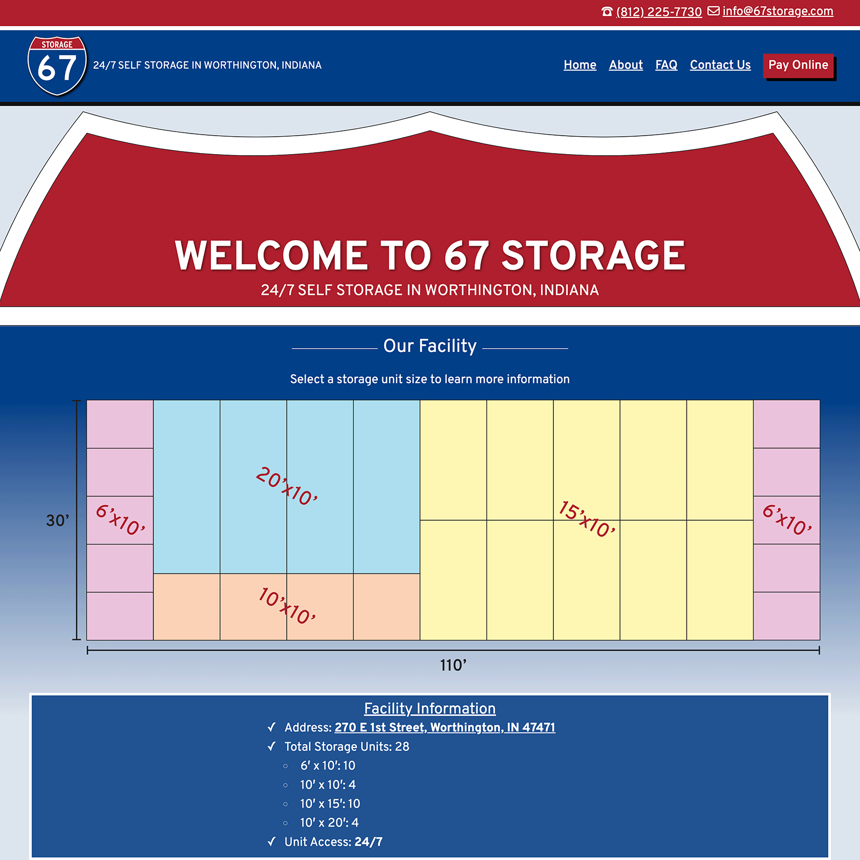
    Screenshot of 67 Storage's homepage featuring a welcome message, a diagram of available storage unit sizes, and facility information including address, total units, and 24/7 access.

    Key features of the site include detailed information about available storage units, a comprehensive FAQ section, and integration with a payment processor, facilitating easy rent payments for customers. Additionally, the website is equipped with contact forms designed to cater to prospective customers, simplifying the process of inquiring about rentals. This strategic combination of form and function embodies 67 Storage’s commitment to service accessibility and customer convenience, ensuring the website not only serves as a digital storefront but also as a tool for operational efficiency.

    Key Takeaway

    Working closely together with Roman, we took the initial seeds of a business idea, patiently nurturing them through a collaborative journey to fruition. It was our personal approach to this collaboration—taking the time to understand Roman’s vision, marketing goals, and the core values he wanted to portray—that let us create more than just a name or logo; we built an identity that truly embodied the key principles of efficiency, security, and customer focus.

    This project was more than a branding initiative; it was a testament to the power of personalized collaboration. By establishing a strong sense of trust with Roman and understanding his vision, we were able to ensure the branding truly reflected the essence of his business. This synergy created a robust, impactful brand that held a distinct logo and strong digital presence.

    67 Storage is no longer only an idea, but a living representation of Roman’s vision, bringing a tangible impact to the marketplace. It stands as the embodiment of thorough deliberation, cooperative work, and perseverance, and we’re immensely proud to be part of this evolving journey of 67 Storage. Our collaboration with Roman underscores the incredible outcomes that can be achieved through an individualized, insight-driven approach to business development.