
Transforming Ideas into Virtual Reality: The Genesis of 67storage.com
The creation of 67 Storage was a branding project that challenged our creativity and technical expertise but also strengthened our belief in the power of one-on-one collaboration.
Our partnership with Roman, the business owner behind 67 Storage, started with a mission to craft a digital web presence and branding that mirrors the efficiency, security, and user-friendliness of their recently built storage units on Highway 67.
Our branding project began with making a pivotal decision. Roman initially sought to name his venture after his last name, “Manley Enterprises”. However, after sitting down with Roman and getting a better understanding of his marketing goals, we found an opportunity for a more intuitive connection with potential clients.
We brainstormed and design a brand that wasn’t only a name, but also a literal signpost. A logo that encapsulated the business’s essence and its geographical significance. Drawing from its strategic location off of Highway 67, “67 Storage” was born.
This decision wasn’t just about picking a name—it was about crafting a scalable, recognizable, memorable, and easily searchable brand identity across both digital platforms and physical mediums for future customers. ’67 Storage’ was more than a choice; it was a strategic decision that streamlined the discovery process for potential clients.
Brand Identity Creation – Forging the 67 Storage Identity Inspired by the Open Road
With the name “67 Storage” setting the stage, the journey towards creating a cohesive brand identity began.
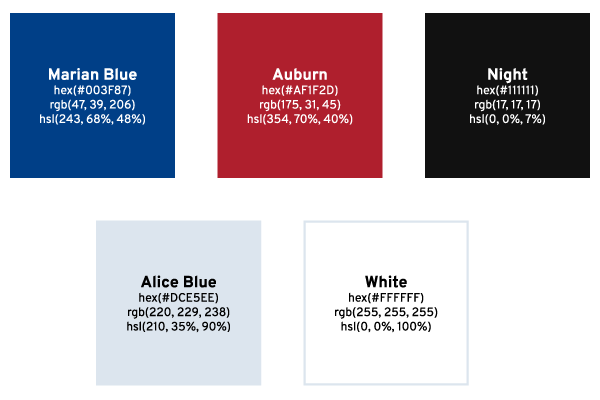
Color Scheme
A Palette Born from the Road
The color scheme transitioned from concept to palette, drawing from the distinctive colors of highway road signs. This choice was intentional, aiming to evoke a sense of reliability and guidance, much like the road signs that navigate travelers to their destinations. The colors chosen were more than just visually appealing; they were a narrative in themselves, telling a story of trust, direction, and safety.
Typography
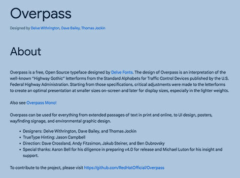
Typography plays a pivotal role in bridging 67 Storage’s brand identity with its digital presence. Research into the typography of highway signs—specifically Highway Gothic and Clearview—revealed the practical challenges of licensing and digital optimization. Thus, for the logo, we chose Interstate, a font inspired by highway signage yet suitable for digital use, found on Adobe Fonts. For the website, Overpass from Google Fonts was selected for its web optimized design and open source license, ensuring a consistent, readable online experience. This thoughtful selection allowed us to maintain a connection to the brand’s roots while adapting to the digital landscape.
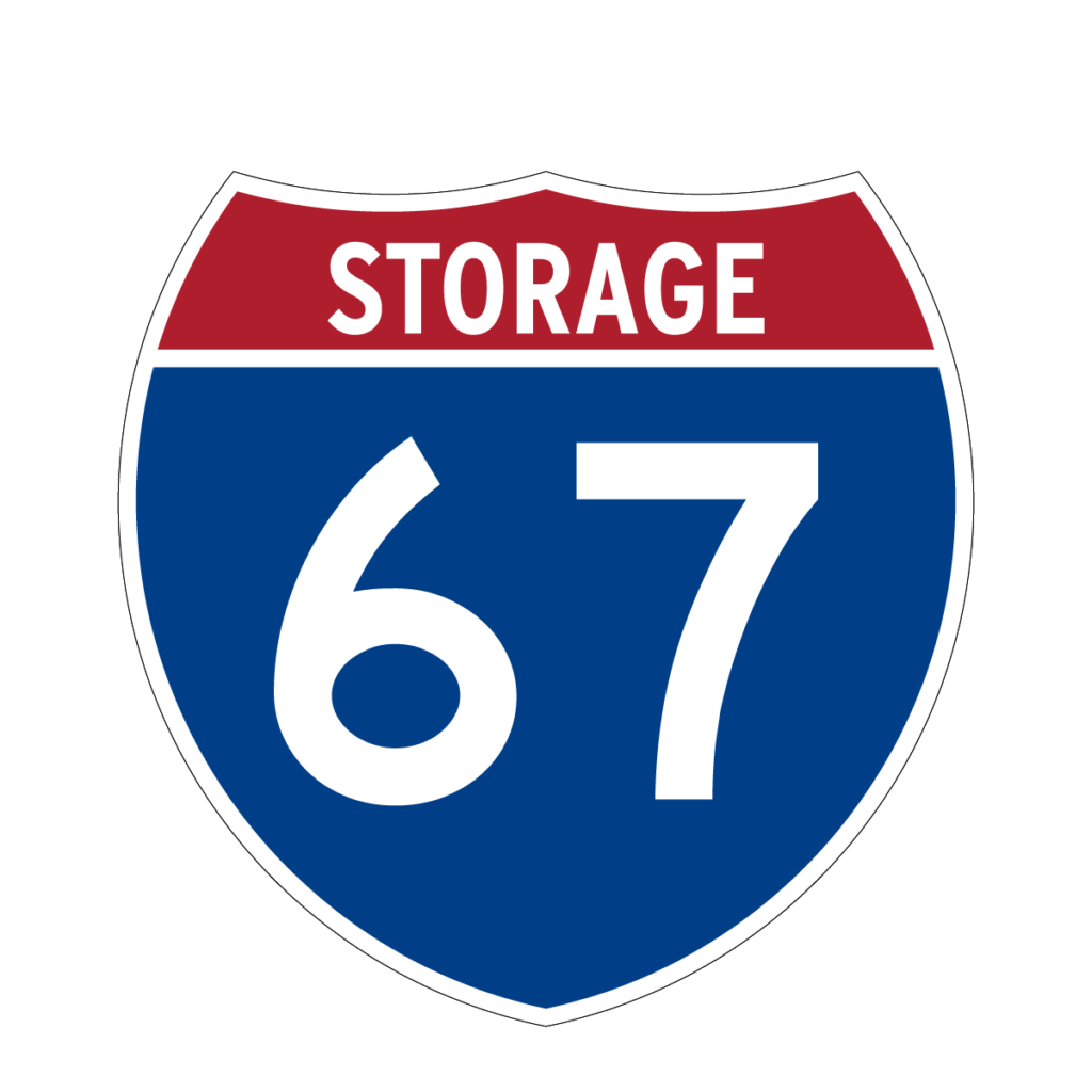
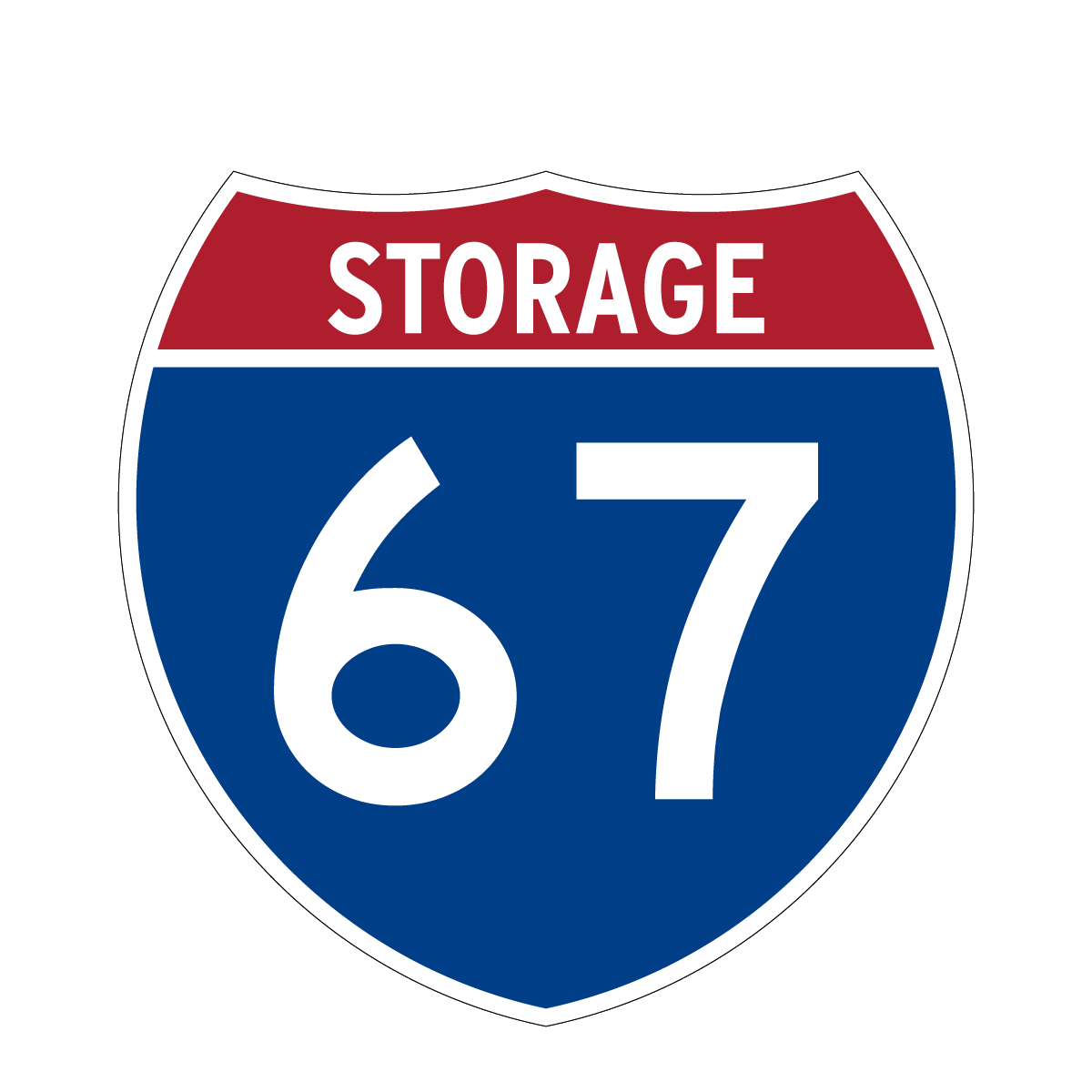
Logo Design
Drawing inspiration from the very roots of the name, the brand’s visual identity took cues from highway signs—a nod to the name’s origin and a brilliant play on familiarity and visibility. The logo was fashioned to mirror the clarity and straightforwardness of highway signage, ensuring instant recognition and connection.
Business Card Design
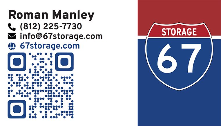
For the business card, we compressed 67 Storage’s brand identity into a readable, impactful design. The layout and iconography is intentionally minimalist to focus on clearly displaying key contact information. To balance the white space of the card, we crafted a background that aligns with the shield logo on the right. This enhances the card’s visual appeal and brand recognition. Moreover, a QR code links to the 67 Storage website for ease of customer access. Our design approach makes the business card an efficient networking tool and extension of the 67 Storage brand identity.
Picking 67storage.com: Securing a Strong Online Presence
Selecting the right domain name for 67 Storage was a crucial decision to make. Picking an overly complicated or hard to remember domain name could considerably impact it’s ability for customers to find and remember. To avoid this, we decided on 67storage.com, a short, straightforward domain name that both reinforces the brand identity and simplifies the customer’s journey to finding the business online online.
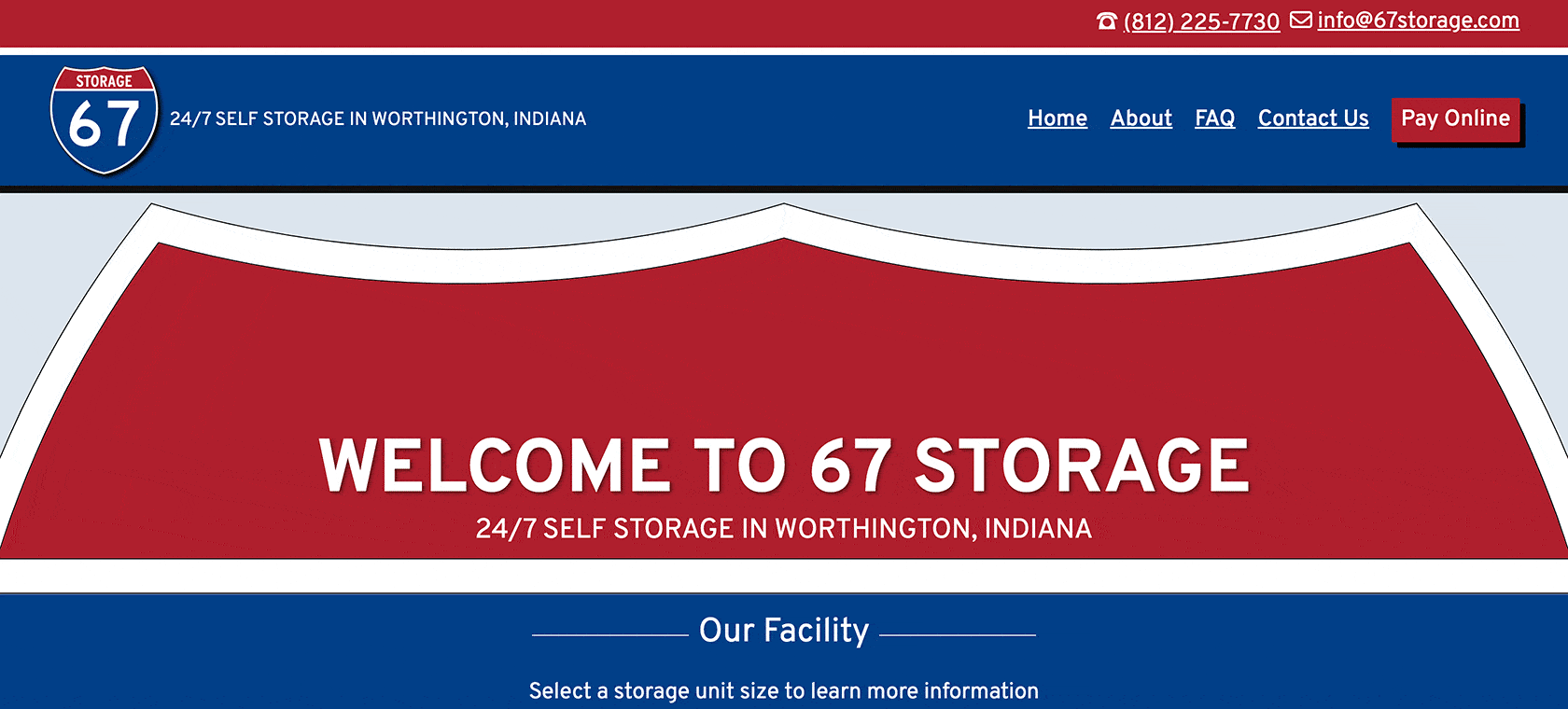
WordPress Website & Design: Crafting a User-Centric Online Space
The website for 67 Storage was intentionally designed to radiate its unique identity while focusing on two primary objectives: attracting new customers and enabling online payment for storage unit rentals. Using WordPress, we customized the latest 2024 Theme and enriched it with hand-coded Custom CSS. This approach added a layer of interactivity to navigation elements, buttons, and links, improving the overall user experience. For style, significant customization was made on the page template to echo the brand’s signature shield motif, ensuring a visual consistency across the digital and physical aspects of the brand.
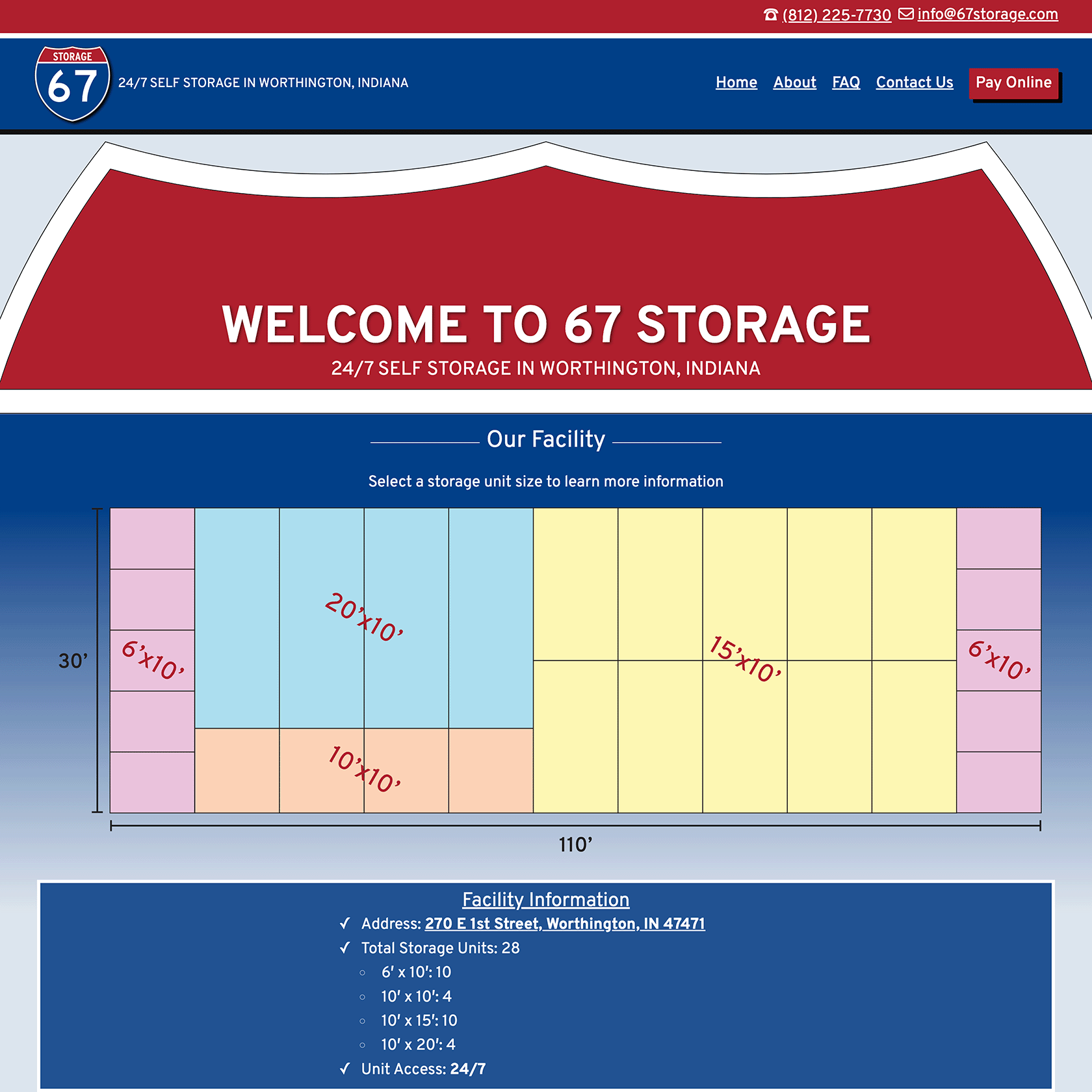
Key features of the site include detailed information about available storage units, a comprehensive FAQ section, and integration with a payment processor, facilitating easy rent payments for customers. Additionally, the website is equipped with contact forms designed to cater to prospective customers, simplifying the process of inquiring about rentals. This strategic combination of form and function embodies 67 Storage’s commitment to service accessibility and customer convenience, ensuring the website not only serves as a digital storefront but also as a tool for operational efficiency.
Key Takeaway
Working closely together with Roman, we took the initial seeds of a business idea, patiently nurturing them through a collaborative journey to fruition. It was our personal approach to this collaboration—taking the time to understand Roman’s vision, marketing goals, and the core values he wanted to portray—that let us create more than just a name or logo; we built an identity that truly embodied the key principles of efficiency, security, and customer focus.
This project was more than a branding initiative; it was a testament to the power of personalized collaboration. By establishing a strong sense of trust with Roman and understanding his vision, we were able to ensure the branding truly reflected the essence of his business. This synergy created a robust, impactful brand that held a distinct logo and strong digital presence.
67 Storage is no longer only an idea, but a living representation of Roman’s vision, bringing a tangible impact to the marketplace. It stands as the embodiment of thorough deliberation, cooperative work, and perseverance, and we’re immensely proud to be part of this evolving journey of 67 Storage. Our collaboration with Roman underscores the incredible outcomes that can be achieved through an individualized, insight-driven approach to business development.