Tag: Branding

  • From Roots to Results: The Story of Indiana Greenscape Solutions

    From Roots to Results: The Story of Indiana Greenscape Solutions


    🌱 The Seed of an Idea

    The story of Indiana Greenscape Solutions begins with Kelly and Beth Fort—partners in both family and business—who, along with their four daughters, Rayne, Autumn, Bree, and Eden, had a vision. As lifelong plant science enthusiasts with deep agricultural roots, they wanted to bring high-quality, personalized lawn care and landscaping services to Bloomington, Indiana. With a strong commitment to family values and customer-focused care, they set out to cultivate a business that would serve their community while laying the groundwork for a legacy their daughters could be proud of.

    When Kelly first sat down for a consultation with me, Dave Martin from David Martin Design, he had a clear objective: to build a reliable online presence for Indiana Greenscape Solutions. We weren’t just creating a logo or launching a website—we were sowing the seeds of a brand that would grow and thrive.


    🛠️ Building the Foundation: Branding and Identity

    We started with the name. We wanted something that combined local pride with a clear description of the services offered. After exploring several options, Indiana Greenscape Solutions emerged as the perfect choice—highlighting both the state-specific service area and the business’s focus on thoughtful, solution-oriented lawn care.

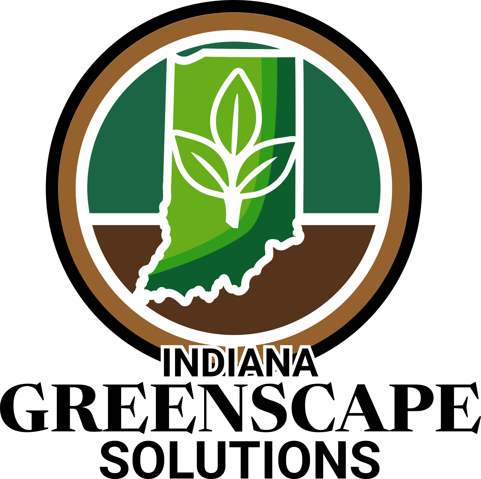
    Next came the logo design. We chose a stylized leaf intertwined with the shape of Indiana, subtly reminding customers of the business’s local roots. The color palette blends earth tones for a sense of trust and professionalism with lively greens to evoke growth and vitality. The fonts were deliberately selected: modern and approachable for Indiana Greenscape and more traditional for Solutions to convey reliability.

    The tagline came naturally: “Indiana’s Lawns, Lovingly Landscaped.” It was a phrase that reflected both the meticulous care the Fort family put into their work and the warmth they bring to customer relationships.


    💻 Crafting the Digital Landscape

    A workspace showing Indiana Greenscape Solutions branding materials, including a door hanger and business card, alongside a laptop displaying the company's website with a green-themed design.

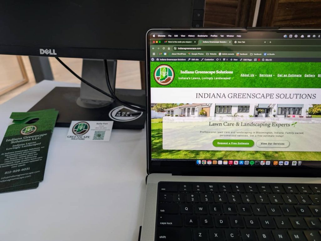
    A strong name and logo deserve a home, so we turned our attention to the website, indianagreenscape.com. The goal was to create a simple yet professional site showcasing services, pricing, and a clear call to action for estimates. We focused on intuitive navigation and SEO best practices, ensuring the site is structured for both visitors and search engines.

    During our screen-sharing session, I walked Kelly through the domain registration process. We registered the domain in his name—because, as I always say, I want my clients to own their intellectual property. It’s their business, their brand, their hard work.

    Key features of the site include:

    • Service Pages: Clear descriptions of core services—mowing, fertilization, and aeration.
    • Contact & Estimate Form: Simple, user-friendly forms to encourage visitors to request free estimates.
    • Payment Integration: Stripe was integrated through WordPress plugins, making it easy for customers to pay invoices online.

    🌿 The Services: Precision Lawn Care

    Indiana Greenscape Solutions doesn’t just mow grass; they cultivate healthy, vibrant lawns with science-backed methods and family-level care.

    1. Mowing & Maintenance:
      Each lawn is treated with precision. Mower blades are sharpened weekly to prevent grass damage, and mulching kits recycle nutrients back into the soil. Every mow is accompanied by meticulous edging, trimming, and debris removal.
    2. Fertilization & Weed Control:
      With a certified pesticide applicator license, the team uses a five-treatment lawn care program that supports turf health while ensuring the safety of families, pets, and local wildlife.
    3. Core Aeration:
      This annual service alleviates soil compaction, improving water and nutrient absorption and encouraging deeper root growth.
    4. Seasonal & Specialty Services:
      From soil sampling and garden bed installations to snow removal and Christmas light installations, the Fort family understands the importance of year-round lawn care.

    🚀 Tech, Tools, and Growth Strategies

    Behind the scenes, we implemented several tools to streamline operations and prepare for growth:

    • Google Workspace: For professional email, document sharing, and team communication.
    • Stripe: Integrated for effortless invoicing and secure payment processing.
    • Yardbook CRM: To handle customer relationships, scheduling, and billing.
    • SEO Optimization: Structured content, relevant keywords, and plugins to control meta descriptions, helping the site climb local search rankings.

    We also explored potential winter services like junk removal, fence staining, and pressure washing to maintain year-round revenue streams.


    🌻 Marketing and Community Engagement

    With branding and technology in place, we turned to marketing strategies to generate buzz. The team distributed door hangers and business cards throughout neighborhoods like Blue Ridge (47408). We encouraged customers to leave positive online reviews and launched a referral program offering discounts for word-of-mouth recommendations.

    The #bragbox channel in The Mill’s Slack Workspace became a great way to share success stories and show off the beautiful lawns that Indiana Greenscape Solutions was creating across Bloomington.


    🌐 Looking Ahead: Growing Stronger Every Season

    The Fort family’s dedication to lawn care mirrors the care they put into growing their business. Every stripe on a freshly mowed lawn, every precisely trimmed hedge, and every lush, green yard stands as a testament to their hard work and family values.

    So, if your lawn needs some love, don’t wait!
    Visit indianagreenscape.com to request a free estimate, fill out the contact form, or even shoot them an SMS to get started. Whether it’s a routine mow or a complete landscape transformation, Indiana Greenscape Solutions is ready to make your outdoor space the envy of the neighborhood.

    Here’s to green lawns, thriving roots, and the incredible growth of a family business that started with a simple dream.


    – Dave Martin, Marketing & Design Consultant, David Martin Design 🌱💻🌳

  • Building 67 Storage: A Branding Case Study

    Building 67 Storage: A Branding Case Study

    Transforming Ideas into Virtual Reality: The Genesis of 67storage.com

    The creation of 67 Storage was a branding project that challenged our creativity and technical expertise but also strengthened our belief in the power of one-on-one collaboration.

    Our partnership with Roman, the business owner behind 67 Storage, started with a mission to craft a digital web presence and branding that mirrors the efficiency, security, and user-friendliness of their recently built storage units on Highway 67.

    Our branding project began with making a pivotal decision. Roman initially sought to name his venture after his last name, “Manley Enterprises”. However, after sitting down with Roman and getting a better understanding of his marketing goals, we found an opportunity for a more intuitive connection with potential clients.

    We brainstormed and design a brand that wasn’t only a name, but also a literal signpost. A logo that encapsulated the business’s essence and its geographical significance. Drawing from its strategic location off of Highway 67, “67 Storage” was born.

    This decision wasn’t just about picking a name—it was about crafting a scalable, recognizable, memorable, and easily searchable brand identity across both digital platforms and physical mediums for future customers. ’67 Storage’ was more than a choice; it was a strategic decision that streamlined the discovery process for potential clients.

    Brand Identity Creation – Forging the 67 Storage Identity Inspired by the Open Road

    With the name “67 Storage” setting the stage, the journey towards creating a cohesive brand identity began.

    Color Scheme

    A Palette Born from the Road

    The color scheme transitioned from concept to palette, drawing from the distinctive colors of highway road signs. This choice was intentional, aiming to evoke a sense of reliability and guidance, much like the road signs that navigate travelers to their destinations. The colors chosen were more than just visually appealing; they were a narrative in themselves, telling a story of trust, direction, and safety.

    Typography

    Typography plays a pivotal role in bridging 67 Storage’s brand identity with its digital presence. Research into the typography of highway signs—specifically Highway Gothic and Clearview—revealed the practical challenges of licensing and digital optimization. Thus, for the logo, we chose Interstate, a font inspired by highway signage yet suitable for digital use, found on Adobe Fonts. For the website, Overpass from Google Fonts was selected for its web optimized design and open source license, ensuring a consistent, readable online experience. This thoughtful selection allowed us to maintain a connection to the brand’s roots while adapting to the digital landscape.

    Screenshot of the ClearviewHwy Complete Family font licensing options showing a price of $795 for a single computer license.
    ClearviewHwy font single computer license purchase page indicating the cost of $795, which informed the decision to select Overpass for the 67 Storage website.
    Informational screenshot detailing Overpass, a free, open-source typeface from Google Fonts, designed for web and environmental graphic design.
    Screenshot highlighting Overpass, a versatile typeface from Google Fonts, chosen for its compatibility with 67 Storage’s branding and logo.

    Logo Design

    Drawing inspiration from the very roots of the name, the brand’s visual identity took cues from highway signs—a nod to the name’s origin and a brilliant play on familiarity and visibility. The logo was fashioned to mirror the clarity and straightforwardness of highway signage, ensuring instant recognition and connection.

    Logo of "67 Storage" resembling a traditional American highway sign with a shield shape, red and blue color scheme, and large white "67" in the center.
    Logo of "67 Storage" resembling a traditional American highway sign with a shield shape, red and blue color scheme, and large white "67" in the center.
    Logo of "67 Storage" resembling a traditional American highway sign with a shield shape, red and blue color scheme, and large white "67" in the center.
    Logo of "67 Storage" resembling a traditional American highway sign with a shield shape, red and blue color scheme, and large white "67" in the center.
    Logo of "67 Storage" resembling a traditional American highway sign with a shield shape, red and blue color scheme, and large white "67" in the center.

    Business Card Design

    Business card for 67 Storage featuring contact details, a QR code for the website, and the company's shield logo with the number 67.

    For the business card, we compressed 67 Storage’s brand identity into a readable, impactful design. The layout and iconography is intentionally minimalist to focus on clearly displaying key contact information. To balance the white space of the card, we crafted a background that aligns with the shield logo on the right. This enhances the card’s visual appeal and brand recognition. Moreover, a QR code links to the 67 Storage website for ease of customer access. Our design approach makes the business card an efficient networking tool and extension of the 67 Storage brand identity.

    Picking 67storage.com: Securing a Strong Online Presence

    Selecting the right domain name for 67 Storage was a crucial decision to make. Picking an overly complicated or hard to remember domain name could considerably impact it’s ability for customers to find and remember. To avoid this, we decided on 67storage.com, a short, straightforward domain name that both reinforces the brand identity and simplifies the customer’s journey to finding the business online online.

    WordPress Website & Design: Crafting a User-Centric Online Space

    The website for 67 Storage was intentionally designed to radiate its unique identity while focusing on two primary objectives: attracting new customers and enabling online payment for storage unit rentals. Using WordPress, we customized the latest 2024 Theme and enriched it with hand-coded Custom CSS. This approach added a layer of interactivity to navigation elements, buttons, and links, improving the overall user experience. For style, significant customization was made on the page template to echo the brand’s signature shield motif, ensuring a visual consistency across the digital and physical aspects of the brand.

    Screenshot of 67 Storage's homepage featuring a welcome message, a diagram of available storage unit sizes, and facility information including address, total units, and 24/7 access.

    Key features of the site include detailed information about available storage units, a comprehensive FAQ section, and integration with a payment processor, facilitating easy rent payments for customers. Additionally, the website is equipped with contact forms designed to cater to prospective customers, simplifying the process of inquiring about rentals. This strategic combination of form and function embodies 67 Storage’s commitment to service accessibility and customer convenience, ensuring the website not only serves as a digital storefront but also as a tool for operational efficiency.

    Key Takeaway

    Working closely together with Roman, we took the initial seeds of a business idea, patiently nurturing them through a collaborative journey to fruition. It was our personal approach to this collaboration—taking the time to understand Roman’s vision, marketing goals, and the core values he wanted to portray—that let us create more than just a name or logo; we built an identity that truly embodied the key principles of efficiency, security, and customer focus.

    This project was more than a branding initiative; it was a testament to the power of personalized collaboration. By establishing a strong sense of trust with Roman and understanding his vision, we were able to ensure the branding truly reflected the essence of his business. This synergy created a robust, impactful brand that held a distinct logo and strong digital presence.

    67 Storage is no longer only an idea, but a living representation of Roman’s vision, bringing a tangible impact to the marketplace. It stands as the embodiment of thorough deliberation, cooperative work, and perseverance, and we’re immensely proud to be part of this evolving journey of 67 Storage. Our collaboration with Roman underscores the incredible outcomes that can be achieved through an individualized, insight-driven approach to business development.